2.0
Typeface Combos
The following is a list of all the typefaces used together in this book. For each Exploration, the faces are listed in order of use.
Designing with two (or more) typefaces requires a bit of forethought and sensitivity. There is no shame in using one typeface at a time until you feel comfortable with the more complex task of using multiple fonts together. Although theoretically any two typefaces can be used together, it really depends on exactly how and why they are used; realistically, some faces just don’t look very good together.
The possibilities for combining typefaces are endless; however, the basic guideline is to select (1) a serif face and a sans serif face that (2) have similar shapes. One way to discover typefaces with similar shapes is to look for ones designed by the same designer or created during the same era.
Note that type set in two different typefaces in the same point size may not look like it is the same size. Sometimes this works to your advantage. Other times, you will want the two faces to look like they are the same size because they need to express the same hierarchy. To make two typefaces look like they are the same size, make their x-heights match by using them at two different point sizes.
If you see a combination here that you like, but you don’t have access to one or more of the typefaces, create a new combination by substituting one of the free or low-cost alternatives listed in the book.
- 1.1

- Exploration
- FF Meta Normal
- Colophon
- FF Meta Serif Bold Italic
- 1.2

- Exploration
- ITC Mendoza Roman Book
- Colophon
- FF Scala Sans Regular
- 1.3

- Exploration
- PMN Caecilia 56 Italic
- Colophon
- Jeunesse Sans Regular
- 2.1

- Exploration
- ITC Officina Sans
- Colophon
- Chaparral Italic
- 2.2

- Exploration
- FF QType Condensed Book
- Colophon
- Kettler Bold
- 2.3

- Exploration
- FF BeoSans Hard R20
- Colophon
- FF Tisa Bold, FF Tisa Regular
- 2.4

- Exploration
- FF Engine Light Italic
- Colophon
- Cholla Unicase
- 2.5

- Exploration
- FF Tibere Regular
- Colophon
- FF Pullman Inline
- 3.1

- Exploration
- FF OCR-F Light
- Colophon
- FF Beadmap Inline
- 3.2

- Exploration
- Bell Centennial Address
- Colophon
- Cooper Black Italic
- 3.3

- Exploration
- FF Nuvo Medium
- Colophon
- FF Beowolf R20
- 4.1

- Exploration
- FF Tronic Regular, FF Folk
- Colophon
- News Gothic Bold
- 4.2

- Exploration
- FF Cube Light
- Colophon
- FF Dot Matrix Two Extended
- 4.3

- Exploration
- FF Zwo Semibold
- Colophon
- FF Tisa Bold Italic
- 4.4

- Exploration
- MVB Verdigris
- Colophon
- Ideal Sans Bold, Ideal Sans Medium
- 4.5

- Exploration
- FF Netto Regular
- Colophon
- Cholla Slab Bold, Cholla Slab Regular
- 5.1

- Exploration
- Memphis Light
- Colophon
- Avenir Next Heavy
- 5.2

- Exploration
- FF Prater Script, Base 9 Regular
- Colophon
- Base 12 Serif
- 5.3

- Exploration
- Neutraface Text Demi, Rufina Regular
- Colophon
- Rufina Bold Italic
- 5.4

- Exploration
- FF Enzo Medium Italic
- Colophon
- FF Page Serif Demibold Italic
- 5.5

- Exploration
- FF Roice Regular
- Colophon
- FF Daxline Bold, FF Daxline Regular
- 5.6

- Exploration
- Spartan Book Classified
- Colophon
- Suburban Bold
- 5.7

- Exploration
- Lingua, TXT101
- Colophon
- FF Container Regular
- 5.8

- Exploration
- FF Trixie Heavy
- Colophon
- FF Burokrat One
- 6.1

- Exploration
- Matrix Script Bold, FF Scala Sans Regular
- Colophon
- FF Scala Sans Italic
- 6.2

- Exploration
- FF Scala Jewel, FF Scala
- Colophon
- FF Scala Sans Italic
- 6.3

- Exploration
- FF Absara Regular
- Colophon
- FF Absara Sans Bold, FF Absara Sans Regular
- 6.4

- Exploration
- Cholla Unicase, Input Serif Condensed Regular
- Colophon
- FF Info Text Regular
- 6.5

- Exploration
- Sabbath Black Heavy, Adobe Jenson, Dalliance Flourishes
- Colophon
- FF Legato Regular
- 7.1

- Exploration
- Charlemagne Bold, Joanna Nova Italic
- Colophon
- Gill Sans Book
- 7.2

- Exploration
- FF Stealth Regular, FF Hydra Text Light
- Colophon
- FF Hydra Bold
- 7.3

- Exploration
- Goudy Text Regular, FF Parango Regular
- Colophon
- AW Conqueror Light
- 8.1

- Exploration
- FF Schulschrift B LinienEins, FF Profile Light
- Colophon
- FF Profile Bold
- 8.2

- Exploration
- FF Utility Black, FF Utility Light
- Colophon
- Foundry Flek Bold
- 8.3

- Exploration
- Tarzana Wide Bold Italic, Tarzana Wide Regular
- Colophon
- Cholla Slab Oblique
- 9.1

- Exploration
- FF Letter Gothic Text Light
- Colophon
- Oblong Regular
- 9.2

- Exploration
- Fournier Regular, Fournier Italic
- Colophon
- FF Nexus Sans Regular
- 9.3

- Exploration
- Avenir 95 Black, Avenir 95 Black Oblique, Avenir 55 Roman
- Colophon
- Bodoni Old Face Regular
- 9.4

- Exploration
- FF DIN Black, FF DIN Regular
- Colophon
- FF Container
- 9.5

- Exploration
- Lo-Res 12 Bold
- Colophon
- FF Cartonnage
- 10.1

- Exploration
- Perpetua Bold, Perpetua Italic, Perpetua Regular, P22 Victorian Ornaments One
- Colophon
- FF Milo Regular Italic
- 10.2

- Exploration
- FF Legato Demibold, FF Legato Light, FF Dingbats 2.0 Stars and Flowers
- Colophon
- FF Oneleigh Regular
- 10.3

- Exploration
- Centaur, Centaur Italic
- Colophon
- FF Absara Sans Thin
- 11.1

- Exploration
- Photina Ultra Bold, Photina Italic, Photina Regular, Maxime Ornaments
- Colophon
- FF Meta Small Caps
- 11.2

- Exploration
- Maiola Bold, Maiola Regular
- Colophon
- FF Quadraat Sans Italic
- 11.3

- Exploration
- FF Quadraat Bold, FF Quadraat Italic, FF Quadraat Regular
- Colophon
- FF Nuvo Regular
- 12.1
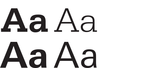
- Exploration
- Serifa 65 Bold, Serifa 45 Light, Linotype Univers Basic Bold
- Colophon
- Linotype Univers Basic Regular
- 12.2

- Exploration
- Le Corbusier Regular, Fakt Medium
- Colophon
- Fakt Semicondensed Semibold
- 12.3
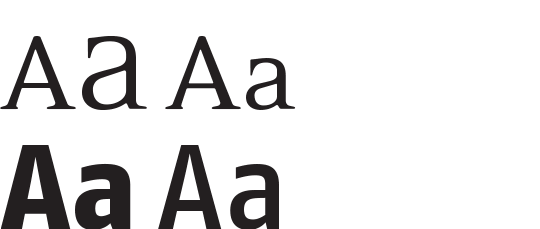
- Exploration
- Eidetic Neo Omni, Eidetic Neo Regular, FF Fago Extra Bold
- Colophon
- FF Fago Medium
- 12.4

- Exploration
- FF Eureka Regular (small caps), FF Eureka Regular, FF Eureka Arrows
- Colophon
- FF Eureka Sans Regular
- 12.5

- Exploration
- Suomi Hand Script, FF Absara Sans Bold, FF Absara Sans Regular
- Colophon
- FF Absara Bold
- 13.1

- Exploration
- FF Sanuk Medium, FF Sanuk Light Italic
- Colophon
- FF Scala Bold
- 13.2
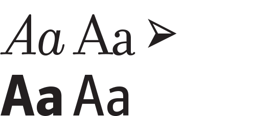
- Exploration
- Filosofia Italic, Filosofia Regular, FF Dingbats 2.0 Arrows, FF Zine Sans Bold
- Colophon
- FF Zine Sans Regular
- 13.3

- Exploration
- FF Fago Extra Bold, Chaparral Bold
- Colophon
- Chaparral Regular
- 13.4

- Exploration
- Officina Serif Bold, Officina Serif Bold Italic, Officina Serif Book
- Colophon
- Syntax
- 14.1

- Exploration
- FF Speak Regular, Democratica Regular
- Colophon
- FF Speak Bold
- 14.2

- Exploration
- Modula Round Ribbed, FF Zine Serif Medium, FF Zine Sans Regular
- Colophon
- FF Zine Slab Medium Italic
- 14.3

- Exploration
- Neue Helvetica Medium, New Clarendon Regular
- Colophon
- Neue Helvetica Heavy Condensed
- 14.4

- Exploration
- Myriad Regular, FF Atma Serif Book
- Colophon
- Matrix Script Bold
- 14.5

- Exploration
- FF Alega Normal, FF Alega Serif Normal
- Colophon
- FF Eboy Regular Beta
- 15.1

- Exploration
- FF Hertz, TXT101
- Colophon
- FF Eureka Sans Regular
- 15.2

- Exploration
- FF Archian Night, FF SubVario Dry
- Colophon
- FF SubVario Dry
- 15.3

- Exploration
- Bell Gothic Black, Bell Gothic Bold
- Colophon
- ITC New Baskerville Bold Small Caps
- 15.4

- Exploration
- ITC New Baskerville Roman, FF Dingbats 2.0 Stars and Flowers
- Colophon
- Bell Centennial Name & Number
- 16.1

- Exploration
- FF Antithesis Regular, FF Antithesis Italic, FF Antithesis Bold
- Colophon
- FF Hydra Bold
- 16.2

- Exploration
- Futura Black, FF Super Grotesk
- Colophon
- FF Super Grotesk Bold
- 16.3

- Exploration
- FF Magda Clean Mono Regular
- Colophon
- FF Hydra Medium
- 16.4

- Exploration
- Eskapade Fraktur Black, FF Quadraat Sans Italic
- Colophon
- Joanna Medium Italic
- 17.1

- Exploration
- Fluidum Bold, FF Clan Thin
- Colophon
- Adelle Regular
- 17.2

- Exploration
- FF Ticket Bold
- Colophon
- FF Gothic Min Condensed
- 17.3

- Exploration
- OCR-B Medium
- Colophon
- Prestige Elite Regular
- 18.1
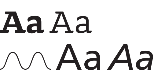
- Exploration
- Doko Bold, Doko Book, Frutiger 55 Regular, Frutiger 56 Italic
- Colophon
- TXT101 Light, Doko Bold, Doko Book
- 18.2

- Exploration
- FF Meta Serif Book, FF Meta Serif Bold, FF Meta Black
- Colophon
- FF Meta Normal
- 18.3
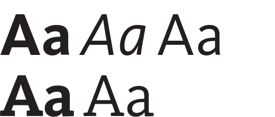
- Exploration
- FF Kievit Bold, FF Kievit Italic, FF Kievit Regular
- Colophon
- FF Kievit Slab Bold, FF Kievit Slab Regular
- 18.4

- Exploration
- FF Nexus Sans Bold, FF Nexus Mix Regular
- Colophon
- FF Nexus Typewriter Regular
- 19.1

- Exploration
- FF ThreeSix Regular, FF ThreeSix Medium
- Colophon
- Audimat Bold Italic, Audimat Regular
- 19.2

- Exploration
- Sauna Small Caps, FF Clifford
- Colophon
- FF Clifford Italic
- 19.3

- Exploration
- Iwan Stencil, FF Strada Regular
- Colophon
- Cholla Slab Bold
- 19.4
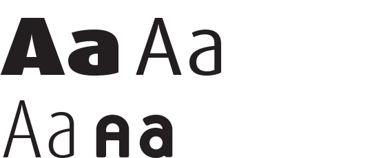
- Exploration
- FF Dax Wide Black, FF Dax Bold, FF Dax Regular, FF Dax Condensed Light
- Colophon
- Platelet
- 20.1

- Exploration
- Ohm Bold, Locator Bold, Locator Regular
- Colophon
- Locator Bold, Locator Regular
- 20.2

- Exploration
- FF Typestar Black, FF Typestar Normal
- Colophon
- Brothers Regular
- 20.3

- Exploration
- FF Seria Sans Bold, FF Seria Regular
- Colophon
- Exocet
- 20.4

- Exploration
- FF Max Fat Italic, FF Max Extra Light, FF Max Regular
- Colophon
- FF Alega Serif Light
- 21.1
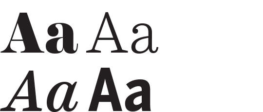
- Exploration
- Harriet Display Black, Harriet Text Light, Harriet Text Medium Italic
- Colophon
- Benton Sans Condensed Bold
- 21.2

- Exploration
- FF Cocon Regular, Sassoon Primary Regular
- Colophon
- Sassoon Primary Regular
- 21.3

- Exploration
- FF Plus Sans Extra Bold, Maxime Regular
- Colophon
- FF Plus Sans Extra Bold Italic
- 21.4
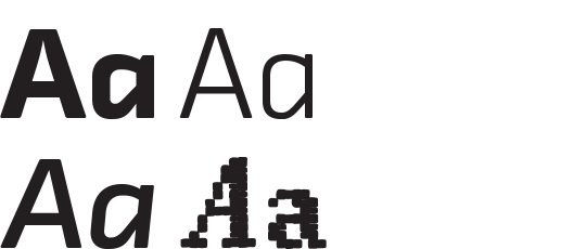
- Exploration
- FF Chambers Sans Black, FF Chambers Sans
- Colophon
- FF Chambers Sans Bold Italic, Folk Art Stitch
- 22.1

- Exploration
- TheMix Black, TheSans Plain, TheSans Bold
- Colophon
- TheSerif Plain
- 22.2

- Exploration
- FF Bau Regular
- Colophon
- Orator
- 22.3
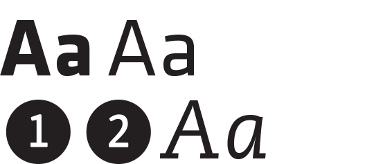
- Exploration
- Klavika Bold, Klavika Regular, PMN Caecilia 86 Heavy Italic, FF Dingbats 2.0 Numbers
- Colophon
- PMN Caecilia 56 Italic
- 22.4

- Exploration
- FF Good Condensed Book
- Colophon
- Unibody 8 Small Caps
- 23.1

- Exploration
- FF Karbid Normal
- Colophon
- Base 12 Serif
- 23.2

- Exploration
- Interstate Regular
- Colophon
- Calvert Regular
- 23.3

- Exploration
- FF Balance Regular
- Colophon
- FF Celeste Bold Italic
- 23.5

- Exploration
- FF Celeste, FF Page Sans Demibold
- Colophon
- FF Page Sans Light
- 23.6

- Exploration
- FF Avance, FF Mister K
- Colophon
- FF Kievit Italic
- 24.1

- Exploration
- FF Cellini Bold, FF Cellini Regular
- Colophon
- FF Cst Berlin West
- 24.2

- Exploration
- Adobe Garamond Bold, Adobe Garamond Roman
- Colophon
- FF Scala Sans Regular
- 24.3

- Exploration
- Linotype Univers Bold Condensed, Linotype Univers Condensed, Linotype Univers Bold, Linotype Univers Light
- Colophon
- FF Fago Office Serif
- 24.4
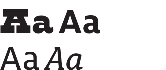
- Exploration
- Monster, FF Milo Bold, FF Milo Text
- Colophon
- FF Avance Italic
- 24.5
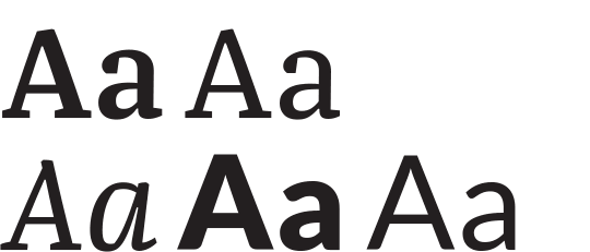
- Exploration
- FF Franziska Demibold, FF Franziska Book, FF Franziska Book Italic
- Colophon
- Lato Black, Lato Regular
- 24.6

- Exploration
- FF Unit Bold, FF Unit Regular Italic, FF Unit Regular, FF Unit Light
- Colophon
- FF Unit Rounded
- BOOK

- Heads
- Output Sans Black
- Text
- Output Sans Medium, Output Sans Medium Italic
Coming Soon!
New resources for teachers using Explorations in Typography are being developed. Come back soon to check out this new feature or join our mailing list to get an email when it’s ready.
